Ace List, Tree, Datagrid
When creating a complex user interfaces it's often required to add elements that allow to the user to select one or more items. The AceTree widget can act as a list, a tree, a datagrid and a datagrid-tree. It is available as the List, Tree and Datagrid plugin in Cloud9.
Based on AceThe AceTree is based on Ace, which is the text editor that Cloud9 uses and is developed by the Cloud9 core team. The Ace editor uses a method called 'virtual viewport' to render it's content. This makes it possible to load a document with 4 million lines in ace. We have used the same technique for AceTree. You can therefore load enormous amounts of data into these widgets without any impact on performance. This makes this ui element especially suited for building professional, scalable UIs.
Topics
- Events and Interaction
- Selection
- Reloading Data
- Renaming and Editing
- Expanding
- Sorting
- Filtering
- Checkboxes
- Resizing
- Theming
- Drag&Drop
- Commands
- Misc
Example CodeIn the next examples we'll load the UI elements inside a dialog. For more information on creating a dialog see the dialog guide.
As a List
The most basic form the AceTree widget can take is that of a list. Let's start of with a simple example and then add more advanced features to show you what the API looks like.
A very basic list rendering two items.
var simpleList = new List({}, plugin);
simpleList.attachTo(htmlParent);
simpleList.setRoot(["Item 1", "Item 2"]);
The object passed as first argument of the constructor allows you to configure the style and behavior of the list. In the next example we'll set the container of the list explicitly so that we don't have to call attachTo(), in addition we configure the list to read data from objects instead of strings.
Every config property can also be set as a property on the widgetYou can set these properties both when creating the widget in it's constructor or by setting them directly on the widget after creation.
var myList = new List({
    container: htmlParent,
    emptyMessage: "No items found",
    dataType: "object"
}, plugin);

myList.setRoot([
    { label: "Item 1" },
    { label: "Item 2" }
]);
This list looks exactly the same as the one in the previous example. A big difference is that you now control the objects that are manipulated by the list. The myList.selectedNode will return your object.
Objects are extended!Be aware that
AceTreeadds a small set of properties to your objects. If you want to prevent this, make sure you create copies of your objects before callingsetRoot()with them.
Custom Renderer
One of the key features of AceTree, besides it's scalability, is your ability to determine how it renders your data. The following example loads a set of custom objects and renders them using a custom row renderer which generates the html that is used to display each item.
customList = new List({
    container: htmlParent,
    rowHeight : 38,
    dataType: "object",

    renderRow: function(row, html, config){
        var node = this.root.items[row];
        var isSelected = this.isSelected(node);

        html.push("<div class='" + (isSelected ? "selected " : "") + "'"
            + " style='height:28px;padding:5px;'>"
            + "<strong>" + node.head + "</strong><br />"
            + node.body + "</div>");
    }
}, plugin);

customList.setRoot([
    { head: "Hey You All!", body: "This is a longer way to say hi to all of you folks!" },
    { head: "Buy More!", body: "Buying more has been long known to improve health and longevity" }
]);
As an alternative to renderRow() there is a set of functions that allow you to set specific html for the caption, icon and other elements. We'll show case those functions when customizing the tree.
As a Tree
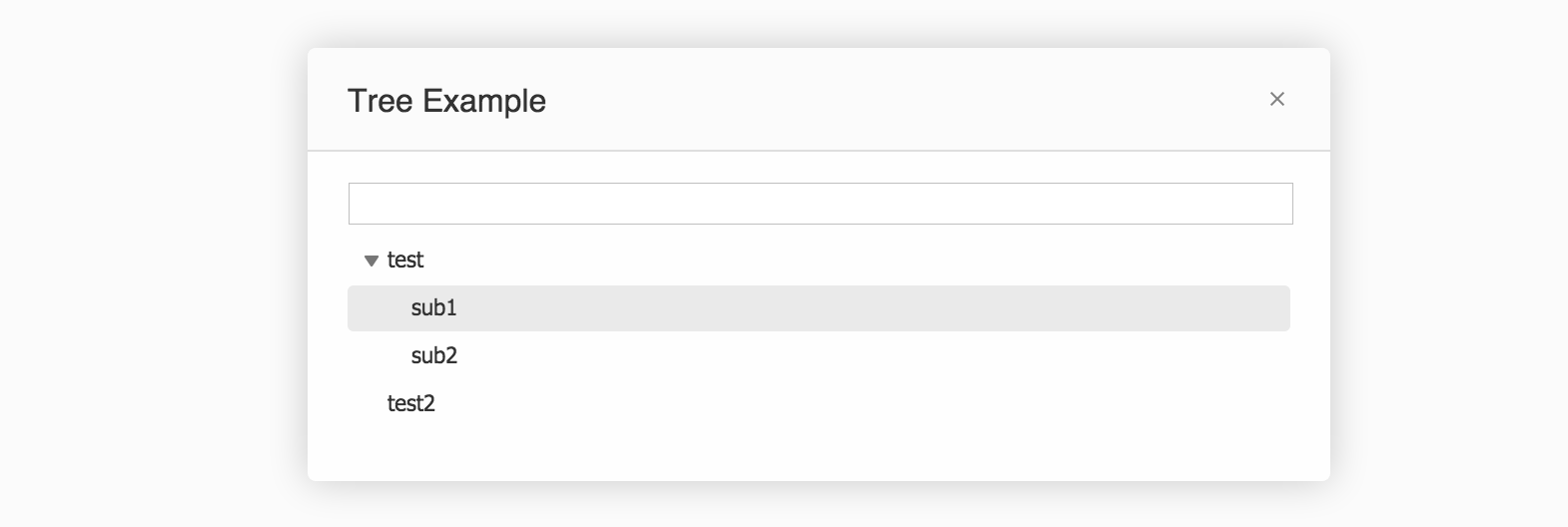
The next form the AceTree widget can take is that of a tree. Let's start of with a simple example and then add more advanced features to show you what the API looks like.
A very basic tree rendering two items.
var simpleTree = new Tree({}, plugin);
simpleTree.attachTo(htmlParent);

simpleTree.setRoot({
    label: "root",
    items: [{
        label: "test",
        items: [
            { label: "sub1" },
            { label: "sub2" }
        ]
    }, { label: "test2" } ]});
});
You might have noticed that we didn't use dataType. This is because the Tree and Datagrid always expect objects as data.
Custom Renderer
You can customize the tree in the same way as we've done with the list in the examples above. This time, instead of using the renderRow() function, we'll define custom renders for only a part of the item, in this case the icon. We have defined three classes in our css called .folder, .default and .loading. We'll set these classes in our getIconHTML() function to set the icon of each row.
var customTree = new Tree({
    container: htmlParent,

    getIconHTML: function(node) {
        var icon = node.isFolder ? "folder" : "default";
        if (node.status === "loading") icon = "loading";
        return "<span class='ace_tree-icon " + icon + "'></span>";
    }
}, plugin);

customTree.setRoot({
    label: "root",
    items: [{
        label: "test",
        isFolder: true,
        items: [
            { label: "sub1" },
            { label: "sub2" }
        ]
    }, { label: "test2", isFolder: true } ]});
As a Datagrid
The next form the AceTree widget can take is that of a tree. The columns array specifies each of the columns. The caption determines the text displayed on the column header. The value is used as the property read from each node. You can mix widths specified in percentage and in pixels, just make sure the percentage totals to 100%.
A basic datagrid rendering two items.
var simpleDatagrid = new Datagrid({
    container: htmlParent,

    columns : [
        {
            caption: "Property",
            value: "label",
            width: "40%",
        },
        {
            caption: "Value",
            value: "value",
            width: "60%",
        },
        {
            caption: "Type",
            value: "type",
            width: "55"
        },
        {
            caption: "CPU",
            getText: function(node) { return node.cpu + "%"; },
            width: "50",
        }
    ]
}, plugin);

myDatagrid.setRoot([
    { label: "test", value: "Example Value", type: "50", cpu: "20" },
    { label: "test2", value: "Example Value 2", type: "50", cpu: "50" }
]);
The getText() function can be used instead of the value attribute. The value that is returned by the getText() function is used as the contents of a cell.

rowHeight is calculated automatically!Note that for the datagrid the
rowHeightis measured based on the css. You can override this behavior by settingrowHeightexplicitly.
As a Datagrid-Tree
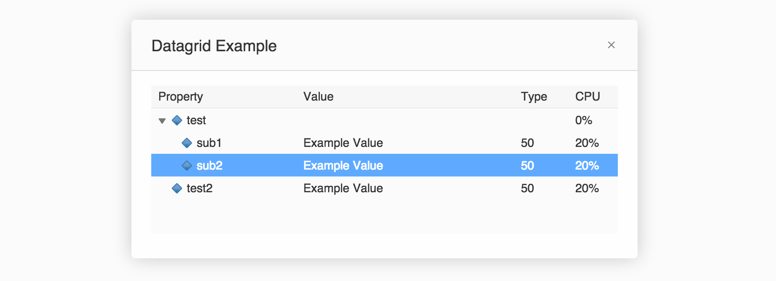
The last form the AceTree widget can take is that of a combined datagrid and tree.
A basic datagrid-tree with a few sub nodes and an icon handler.
var simpleDatagridTree = new Datagrid({
    container: htmlParent,

    columns : [
        {
            caption: "Property",
            value: "name",
            defaultValue: "Scope",
            width: "40%",
            type: "tree"
        },
        {
            caption: "Value",
            value: "value",
            width: "60%"
        },
        {
            caption: "Type",
            value: "type",
            width: "55"
        },
        {
            caption: "CPU",
            getText: function(node) { return (node.cpu || 0) + "%"; },
            width: "50",
        }
    ],

    getIconHTML: function(node) {
        return "<span class='dbgVarIcon'></span>";
    }
}, plugin);

simpleDatagridTree.setRoot({
    label: "root",
    items: [{
        label: "test",
        items: [
            {label: "sub1", value: "Example Value", type: "50", cpu: "20" },
            {label: "sub2", value: "Example Value", type: "50", cpu: "20" }
        ]
    }, {label: "test2", value: "Example Value", type: "50", cpu: "20" } ]});
});
Events & Interaction
The AceTree widgets fire 20 events. In this section we'll discuss 6 commonly used once. We'll mention many of the other events in the sections below.
Click event
The click is fired whenever the user clicks on the widget. You get information about the x and y position of the click as well as access to the native browser event.
simpleTree.on("click", function(e){
    console.log("The user clicked at ", e.x, ", ", e.y);
});
Delete event
The delete event is called when the user deletes an item from the widget, for instance by hitting the DEL button. Note that the widget won't actually manipulate your data object. That is up to you. If you don't remove the selected nodes from the data, they will still be there.
simpleList.on("delete", function(){
    // Manipulate data object here
});
Scroll event
The scroll event is called when the user vertically scrolls through the widget. Remember that these widgets have a virtual viewport and thus only render the content that is on the screen.
myDatagrid.on("scroll", function(){
    console.log("The scroll position is", myDatagrid.scrollTop);
});
To set the scroll simply set the scrollTop property.
myDatagrid.scrollTop = 100;Resize event
The resize event is called when the resize() method is called and the size is actually changed.
myDatagrid.on("resize", function(){
    console.log("This was an actual resize");
});
Expand & collapse events
There are two events that are specific to the tree (and datagrid-tree). These are expand and collapse events. They'll fire when the user expands or collapses an item.
simpleTree.on("expand", function(node){
    console.log("You expanded", node.label);
});
Selection
The selection allows you to manipulate the selection through the select() method. Selection is done by reference and you can select one node or an array of multiple nodes.
myList.select(data[5]); // Select the 5th item
myList.select(data); // Selects all items
At any time retrieve the current selection via one of two properties.
myList.selectedNodes.forEach(function(node){
    console.log(node.label, "is selected);
});

console.log(myList.selectedNode.label, "is the caret");
Listen to the user selecting items using the select events.
myList.on("select", function(){
    console.log("The user selected a node", myList.selectedNode.label);
});
You can disable the ability to select a node by setting the property noSelect to true.
Reloading the data
Cloud9 plugins often want to update the data loaded in the widget. As you update your dataset you need to call the refresh() method to update the widgets view.
simpleTree.root.items[0].label = "New Name";
simpleTree.refresh();
Renaming and Editing
The AceTree widgets have a built-in feature that allows renaming nodes in the List and Tree and to edit a cell in the Datagrid.
For both the Tree and the List simple enable rename to enable this behavior.
myTree.enableRename = true;Now a user can hit F2 or click once on an already selected node to start renaming the item. You can also programmatically trigger renaming.
myList.startRename(myList.selectedNode);
The Datagrid allows you to configure a cell as editable. Simply set the editor property to "textbox" of the appropriate column. You must set enableRename to true to make editing work.
{
    caption: "Value",
    value: "value",
    width: "60%",
    editor: "textbox"
},
Now a user can double click on a cell to start renaming the item. You can also programmatically trigger renaming.
datagrid.startRename(myList.selectedNode, 1); // The 2nd argument is the column index
Rename Events
There are two events related to renaming; beforeRename and afterRename. Use the beforeRename event to validate whether your plugin allows renaming the selected node. You can call e.preventDefault() to disable renaming before it starts. The afterRename event is called when the rename is complete. Just like with the delete event you are responsible for updating the dataset and refreshing the widget.
datagrid.on("beforeRename", function(e) {
    if (e.column.caption == "Value" && e.node.isFolder)
        return e.preventDefault();
});
datagrid.on("afterRename", function(e) {
    sendToServer(e.node.id, e.value, function(err){
        e.node.label = e.value;
        datagrid.refresh();
    });
});
Expanding
To expand a node when setting the data, so before it is loaded in the tree, set isOpen to true.
simpleDatagridTree.setRoot({
    items: [{
        label: "test",
        isOpen: true,
        items: [
            {label: "sub1", value: "Example Value", type: "50", cpu: "20" },
            {label: "sub2", value: "Example Value", type: "50", cpu: "20" }
        ]
    }]
});
Sorting
To influence the sorting of the widget simply add a sort function. This function gets all children of a node (or all nodes for the list) and allows you to sort the list in any way you like.
This example sorts a list alphabetical and makes sure that any folders are at the top of the list.
sort: function(children) {
    var compare = simpleTree.model.alphanumCompare;
    return children.sort(function(a, b) {
        var aIsSpecial = a.tagName == "folder";
        var bIsSpecial = b.tagName == "folder";
        if (aIsSpecial && !bIsSpecial) return 1;
        if (!aIsSpecial && bIsSpecial) return -1;
        if (aIsSpecial && bIsSpecial) return a.index - b.index;

        return compare(a.name + "", b.name + "");
    });
};
Filtering
One of the common interactions, that you'll find throughout the Cloud9 UI is to let the user filter the data in a widget. We've added a very simple way to filter based on a single keyword.
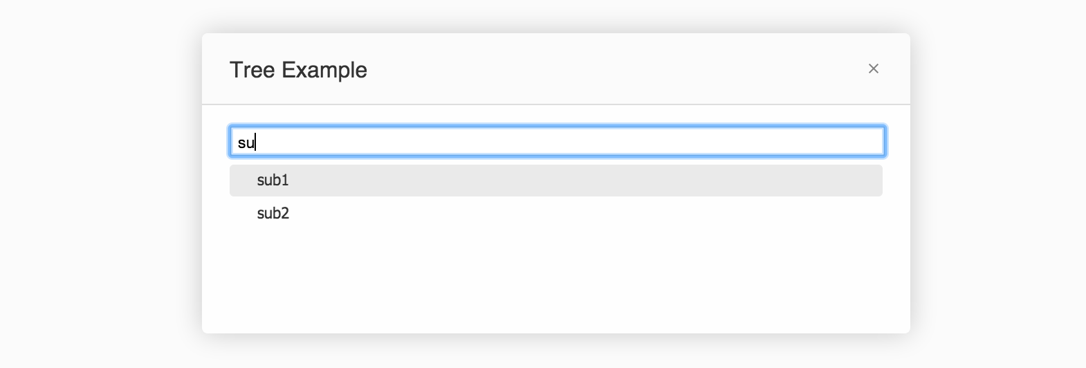
This example combines a textbox with a tree and allows the user to search for items in the tree by typing in the textbox.
htmlParent.innerHTML = "<input class='my-style' />"
htmlParent.firstChild.addEventListener("keyup", function(){
    simpleTree.filterKeyword = this.value;
});

var simpleTree = new Tree({
    container: htmlParent
}, plugin);

simpleTree.setRoot({
    label: "root",
    items: [{
        label: "test",
        items: [
            {label: "sub1"},
            {label: "sub2"}
        ]
    }, {label: "test2"} ]});
Now a user can type into the textbox to only show those elements matching the characters typed.

There are two properties that you can set to configure the filter. The filterCaseInsensitive property when set to false will filter based on case sensitive characters. The filterProperty can be set to a string containing the name of the property on your objects to use for filtering. If this property is not set either label or name are used.
Checkboxes
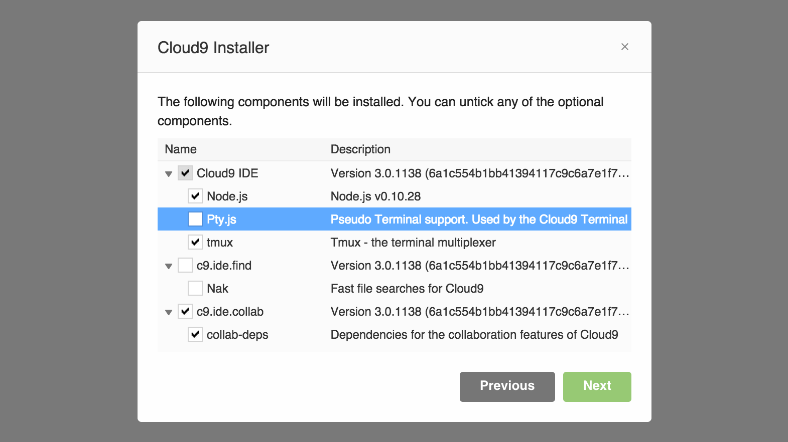
To enable checkboxes in your list, tree or datagrid set enableCheckboxes to true. Each row will display a checkbox which can be set to checked, unchecked and half checked.
datagrid = new Datagrid({
    container: htmlParent,
    enableCheckboxes: true,

    columns : [
        {
            caption: "Name",
            value: "label",
            width: "35%",
            type: "tree"
        },
        {
            caption: "Description",
            value: "description",
            width: "65%"
        }
    ]
}, plugin);

simpleDatagridTree.setRoot({
    items: [{
        label: "test",
        isChecked: true
        items: [
            { label: "sub1", description: "Example Value" },
            { label: "sub2", description: "Example Value" }
        ]
    });
});
Setting isChecked to true on a item will display it as checked. Set it to -1 to have it half-checked and false for unchecked. By default the widget will only toggle between fully checked and unchecked. Setting items as half-checked will require custom code.
This is what that looks like in the Cloud9 installer.

Checkbox methods
To check an item call the check() method.
datagrid.check(item);Similarly to uncheck an item call the uncheck() method.
datagrid.uncheck(item);Checkbox events
When one or more items are checked and unchecked their respective events are called.
datagrid.on("check", function(items){
    console.log("checked", items.map(function(n){ return n.label; }).join(" "));
});
datagrid.on("uncheck", function(items){
    console.log("unchecked", items.map(function(n){ return n.label; }).join(" "));
});
Resizing
It is important to know that the AceTree widgets don't resize automatically. Make sure to call the resize() method whenever they should recalculate their size. By default the resize() method will only trigger if the dimensions of the container have changed, so you can call it as many times as you want. It will also only recompute the area that actually needs it.
This resizes the tree when the browser resizes.
layout.on("resize", function(){
    simpleTree.resize();
}, plugin);
Check theresizeevent of your containerMost Cloud9 UI plugins such as Dialogs and Panels offer a
resizeevent. Simply hook that event and callwidget.resize()to make sure your widget is always correctly rendered.
Theming
Theming of these widgets is done through css. By default the .custom-tree class is applied for List and Tree and the .blackdg class for Datagrid. You can choose to override this and use your own class by setting the theme property. Note that the default themes are configured using the Cloud9 main theme. More information on theming will be documented soon.
widget.theme = "my-own-class"; // Or set theme in the constructor optionsDrag & Drop
The AceTree widgets support drag&drop out of the box. Simply enable it by setting the enableDragDrop property to true.
widget.enableDragDrop = true;Drag & Drop Styling
You control the look of the drag highlighting via css. Simply reference the classes that are used and overwrite any styling you want.
| dragOver | is set on the container when dragging |
|---|---|
| dragImage | class of the node which is dragged |
| dropTarget | class of the parent item that the node is hovering over |
| dragHighlight | class of the children container of the parent that the node is hovering over |

Drag & Drop Events
The following events allow you to control the drag&drop operations. Similar to the delete and rename events it is your responsibility to update the underlying data.
simpleTree.on("drop", function(e) {
    if (e.target && e.selectedNodes) {
        if (e.isCopy)
            copy(e.selectedNodes, e.target);
        else
            move(e.selectedNodes, e.target);
    }
});
The isCopy property is set when the user hold the Ctrl or Command key.
| drop | Fired when the node or nodes are dropped |
|---|---|
| dragIn | Fires when a node is dragging into the widget |
| dragOut | Fires when a node is dragging out of the widget |
| dragMoveOutside | Fires when the node is moves outside of the widget |
| folderDragEnter | Fires when a node drags onto a parent |
| folderDragLeave | Fires when a node drags out of a parent |
| dropOutside | Fires when a node is dropped outside of the widget |
Commands
Similar to Ace and Cloud9 itself, the AceTree widgets have a set of commands that you can execute on the widget.
simpleTree.execCommand("selectAll");The following table lists all the commands available.
| selectAll | Selects all the elements in the widget |
|---|---|
| centerselection | Scrolls the selection into the center of the widget |
| closeOrlevelUp | Collapses the selected node or moves the caret one level up |
| levelUp | Moves the caret one level up |
| levelDown | Moves the caret one level down |
| goToStart | Moves the caret to the start |
| goToEnd | Moves the caret to the end |
| closeAllFromSelected | Collapses all selected nodes |
| openAllFromSelected | Expand all selected nodes |
| pageup | Scroll one page up |
| gotopageup | Move the caret one page up |
| pagedown | Scroll one page down |
| gotopageDown | Move the caret one page down |
| scrollup | Scroll up |
| scrolldown | Scroll down |
| goUp | Move the caret one position up |
| goDown | Move the caret one position down |
| selectUp | Select up |
| selectDown | Select down |
| selectToUp | unselect current node and select node above, keeping other selected nodes |
| selectToDown | unselect current node and select node below, keeping other selected nodes |
| selectMoreUp | select node above cursor, keeping all other nodes selected |
| selectMoreDown | select node below cursor, keeping all other nodes selected |
| rename | Start rename |
| chose | Select and call the choose event |
| delete | Call the delete event |
Misc
One last edge case we found useful when building the Debugger UI was to disable the scrolling behavior of the datagrid and instead have it render all the content. To enable this use the minLines and maxLines properties to set the minimum and maximum amount of lines that should be rendered by the widget before it starts showing a scrollbar.
var myDatagrid = new Datagrid({
    container: htmlParent,
    minLines: 3,
    maxLines: 200
}, plugin);

myDatagrid.setRoot(dataset);
Updated 12 months ago
